Posts

Living Landscape

Image
John Iaccarino Living Landscape This project made me think outside of the box. There are multiple things that are intentionally hidden in the picture. If you look closely, you can see creatures swimming in the lake. The fish are made out of a fist that has hands as fins, while the octopus is comprised of an eyeball as the body and human legs as it's tentacles. The rocks on the beach are comprised of red blood cells. To show depth, I layered the rocks and applied different filters to show depth in the water too. I utilized the dodge and burn tool to illustrate the reflection of the moon onto the water. The mountains are made out of elbows and knees. The snowcaps are fingernails that are painted. The birds are eyebrows and the mood is a human skull. In order to show a night sky, I utilized white dyed hair to show a wispy night sky. The snails provide a pop of color to what is a very dark and cold image. This project was by far my favorite to create.
Colorization

Image
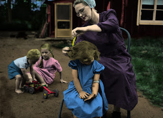
John Iaccarino Colorization Originally, I had chosen another image that had a lot more detail and focal points. I decided to switch to this black and white photo because I felt as though the mom brushing her daughter's hair was the primary focal point.The mom and daughter are in darker colors to draw your eye to them first. In this project specifically, I found it to be very difficult to match skin tone. If I had the opportunity to do this project over again, I would have liked to use a lighter nude color on the girl. I chose to color the toy in traditional red, green and yellow because it mirrors what would have been used in this time period for toys. The dark tones of the woods in the back made it difficult to add color to them. I think that this picture could have used some more shading and highlights to accentuate more of the finer details.

Cut and Paste

Image
John Iaccarino Cut and Paste This project gave me a lot of freedom to do whatever I wanted. I focused on utilizing animals and flowers to fill the space. When choosing images to use, I looked for pictures that were high quality and where the focal point was clearly defined from the background. I added Miley Cyrus to the picture because she has a wild personality just like the animals. I was cautious of how each item would fill the space. This allowed me to strategically place the images in a way that made them work. The images chosen for this cut and paste assignment allowed to overall vibe to be bright and happy.

Self Portrait

Image
John Iaccarino Self Portrait This self portrait was a lot of fun to make. My favorite part of this picture is my polo. I utilized different variations of blue to depict shadows and movement. I had a hard time matching the color of my original picture with the portrait. This prevented me from being able to add more detail to my face. If I had used a higher-quality photo, the results would have probably been different. I used a light faded background to help my portrait pop off of the page. The blotted pattern mirrors the technique that I used when coloring my face. With more time I am confident that I could have improved on making my self portrait more realistic.

Calligram

Image
John Iaccarino Calligram The calligram project was the most time consuming project in this class. I broke the picture up into smaller areas around my facial features. This allowed me to implement more coloring and details in those areas. I chose a blue background to allow my face and t-shirt to stand out. I did not want to use a dark color for the background because I though that it might distract the viewer from my face. I utilized different variations of colors to try and illustrate depth and shadows. This project was one of the more time consuming tasks, but also one of the most fulfilling to see when it was done.

Logos

Image
John Iaccarino Logos This project was one of the most tedious assignments that we were given during the class. I found it to be easiest to separate the image into sections before copying it. This helped break up the image and provide clear guidelines to copy. The colors chosen in the image were taken directly from the logo that was being copied. This allowed me to properly duplicate the image to the best of my ability. 

Canvas Landscape

Image
John Iaccarino Canvas Landscape This project was by far on of the most difficult. I chose to utilize natural tones like browns and dark reds for the house to try and give it more of a realistic vibe. I had a hard time coming up with a live animal to incorporate into this image, so I decided to stick with something simple. The worm allowed me to utilize different techniques and add a funny touch to the landscape. The flower is supposed to be representative of a daisy. The bright pink and red petals are placed like a windmill to show the movement of a breeze. The windows are grey to allow the viewer to make up what they think is inside the house.